How ScatterPie’s dashboard designing service helps you present your analysis in an effective way
Convert your Business KPIs into clever visual designs to give meaningful insights We helped one of our IT service provider clients leverage our dashboard designing services to re-design the UX and UI for 10 business dashboards of an IT Project management service into stunning & intuitive dashboard designs

Industry
ITES
Business Functions
Dashboard Solutions, Data Analytics
Solution Delivered
Dashboard Designing & UI/UX
Technologies
Figma
Geography
Singapore
About The Client
Our client is one of the Singapore-based IT companies providing IT services to East Asian countries. The solution provided by our client is aimed at simplifying operational processes, Incident management with a key focus on tracking Open Incidents, SLAs, Overdue Tasks, Task Trackers. This process includes data capturing & visualizing it into several business dashboards. The client was looking for dashboards that are at a glance preview of the most crucial KPIs and an easy way to navigate directly to various areas of the business KPIs that require users’ attention.
The requirement of dashboard designing was to convert the existing list of KPIs and design into visually appealing, simple to understand and navigate, yet powerful analytics dashboards to make data-informed decisions.
The Major Challenge Our Client Faced
As a solution provider, the first thing our client focused on was building an eco-system to capture all the business data into a custom platform. The challenging part was to convert all the business KPIs into visually appealing yet simple-to-understand dashboard designs for better decision-making.
The client wanted a data-driven system backed by data analytics to give intuitive & interactive dashboards for every business unit but in an eye-catchy & presentable way.
ScatterPie’s Solution
After the research was done, the ScatterPie creative team defined which stats would be the most useful and which of them required to be shown in charts for better perception. The designers ended up providing 10 dashboard designs to cover all the KPIs.
The designer chose to use vibrant color pallets to create an appealing and clean look for the dashboards. All the navigation buttons, client logos, Typography, and icons were used to make the dashboards insightful. For the enterprise dashboard, the background was kept white, with blue and orange colours to highlight the important KPIs.
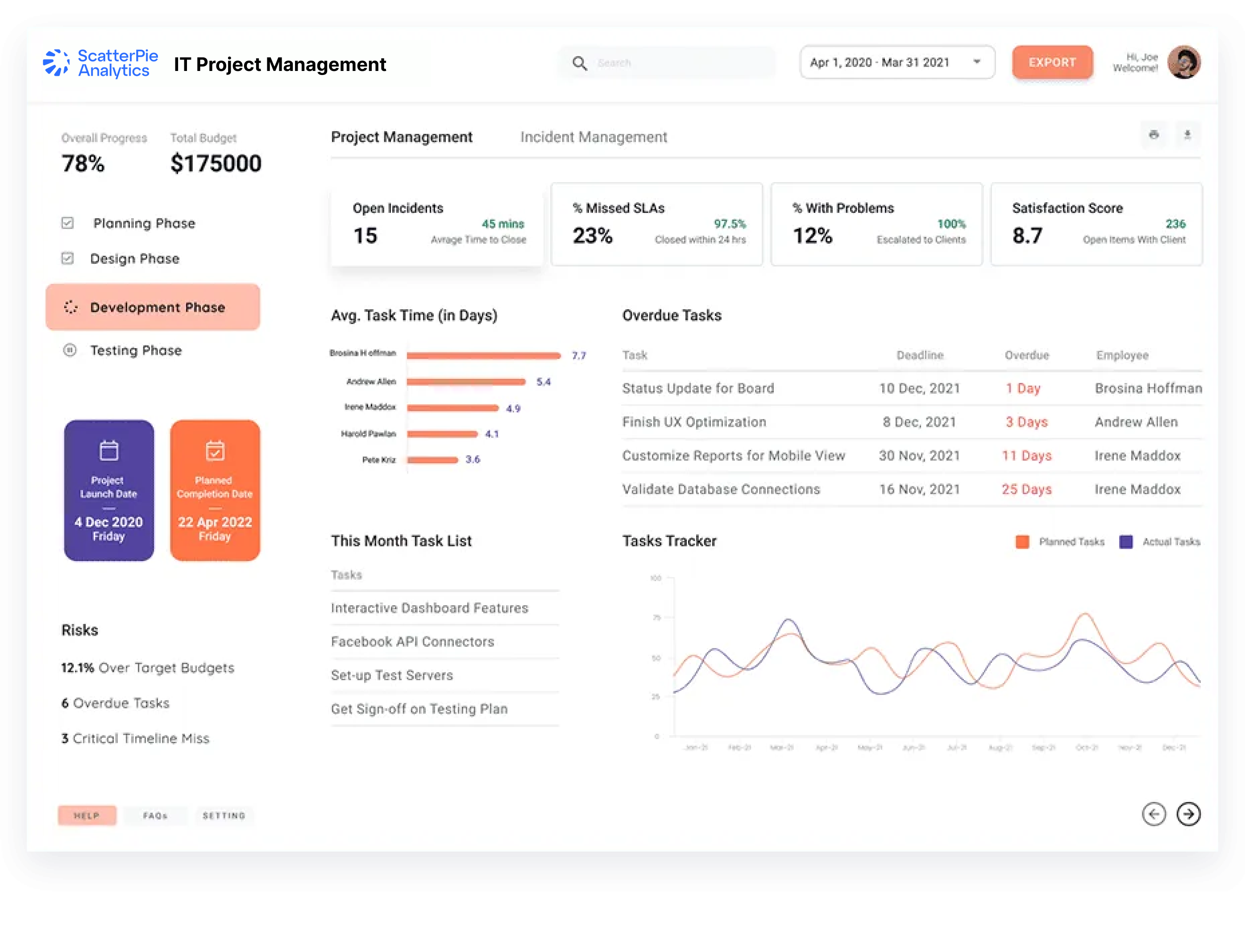
Project Management Dashboard
For tracking open incidents, % Missed SLAs, % with Problems, Client Satisfaction Score, Overdue Tasks, task patterns & risks, it was important to create a dashboard design as clearly as possible because these KPIs are the ones the project manager interacts with most often.
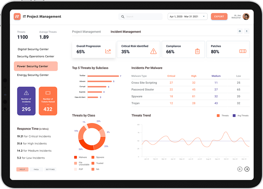
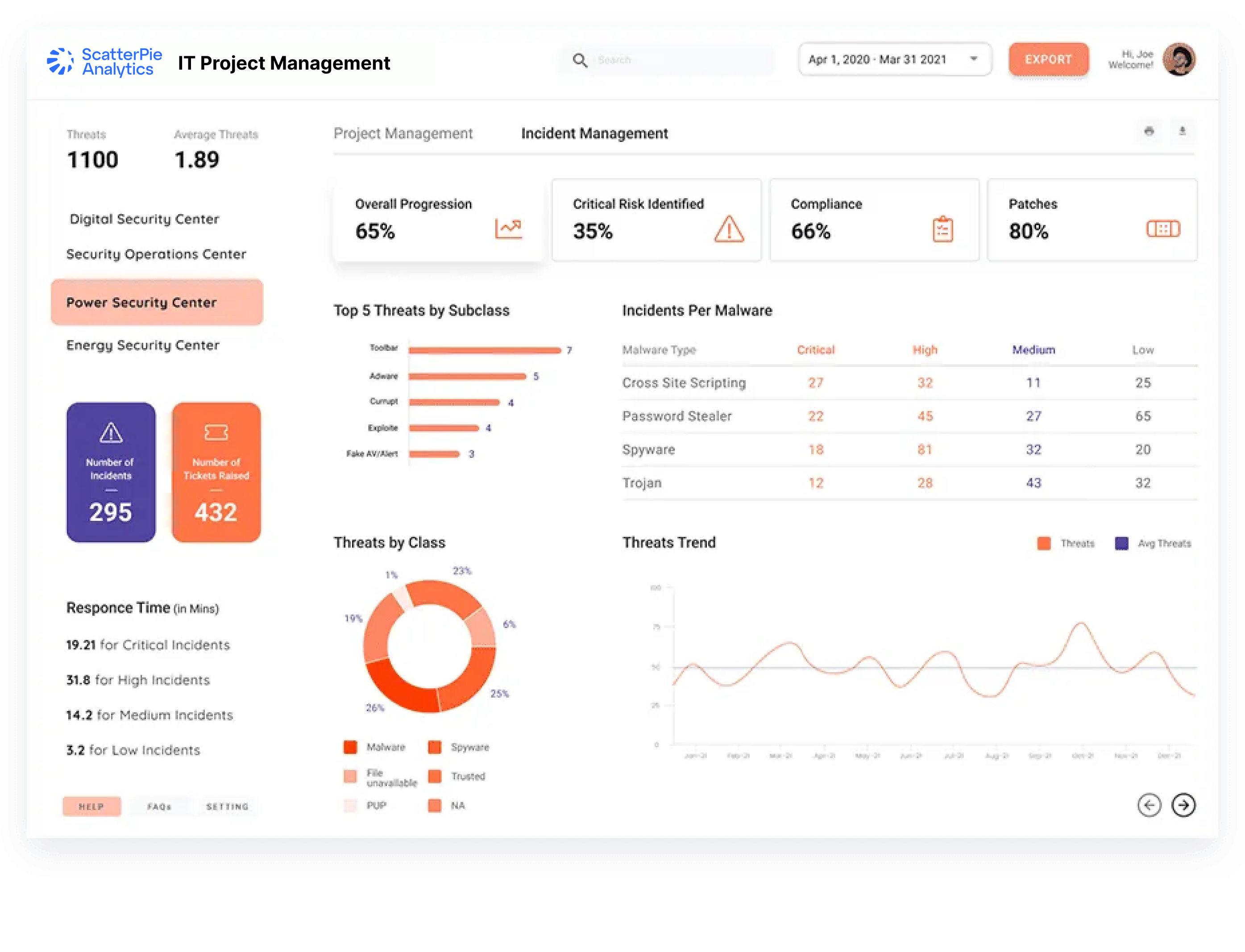
Incident Management Dashboard
For tracking Critical risks, compliances, threats, and response time, we planned a clean design with important KPIs on top (for better visibility), colour codes to differentiate criticality and trend lines to show patterns
 How our client Benefitted through Our Solution
We focused on building designs that would balance informativeness and attractive looks. Our first goal was to present data in a clear and digestible way. Yet, making it beautiful and interactive, we helped project managers see important KPIs quickly and take actions on them.


